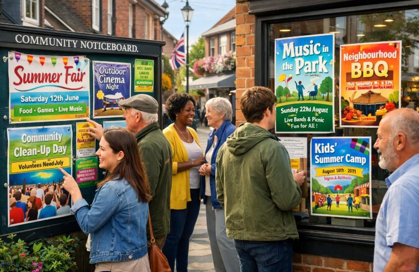
Effective promotion plays a central role in making local events such as fundraisers, arts days, and neighbourhood fairs successful. Posters offer a direct and trusted method for reaching community members quickly.
Design tools have made creating posters much easier for everyone. Many organisers use platforms that guide them through each step. Community groups can select layouts, adjust fonts and colours, and add images without needing special training.
This approach helps small teams create professional-looking results efficiently. Using templates designed for community events makes the process even simpler. Good posters do more than announce a date. They generate interest and build anticipation. Striking visuals with clear messaging make events recognisable and improve their chances of attracting attendees.
Now, creation tools range from free to paid options, giving organisers flexibility to find resources that suit their community needs and event scale. The right choice depends on your specific requirements and budget constraints.
The Impact of Visual Design on Community Event Attendance
Professional-looking materials often capture more attention and encourage greater participation at local events. Using a poster maker, such as Adobe Express’s free poster maker, helps community groups design materials that attract viewers and prompt action. Eye-catching elements can turn a casual glance into real interest and increased turnout.
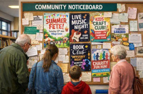
In busy community spaces like libraries and shop windows, people typically scan notices for just a few seconds. Bold colours, clear typography, and striking images help posters stand out.
Effective posters use strong visual hierarchy with the main message at the top and large readable text for dates and times. Keeping main information prominent and supporting visuals clear can help posters make a stronger impact.
Design Elements That Appeal to UK Audiences
British community poster designs often benefit from regional colour considerations. While preferences vary across regions, practical experience shows northern areas often use bold designs, while southern regions feature more subdued colour palettes. Rural communities typically favour traditional colour schemes that connect with local heritage.
Typography affects poster effectiveness significantly. Sans-serif fonts like Arial and Calibri offer excellent readability on community noticeboards, even in poor lighting. Consistent font families throughout create a more unified appearance that reinforces your event’s identity.
Finding the right balance between information and visual appeal helps posters stand out on packed noticeboards. Clear, concise information with engaging images and enough white space makes it easier for readers to notice and remember essential event details.
Essential Components of Effective Community Event Posters
For a community event poster to work well, the order and size of information matter greatly. Place the event date, time, location, and cost in prominent spots near the top in bold or larger type. This helps people find what they need quickly without searching through dense text.
Making date and time stand out prevents common problems like attendees showing up late or missing events. When essential details have clear priority, even a passing glance gives viewers confidence about when and where the event happens.
Try printing a test poster and viewing it from a few metres away. This confirms that primary information catches the eye first, a practical check used by many event organisers to ensure effectiveness.
Use fonts that are big enough and clear for everyone to read. Templates designed for good readability help ensure people with different needs can understand the message. Font sizes for main details should be large enough for easy visibility from a distance.
Choose text and background colours that contrast strongly to help people with vision problems. QR codes have become popular on community posters, linking to online registration or additional information while saving space on the printed material.
Design Strategies for Different Community Events
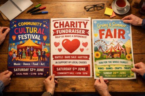
Cultural festivals and fundraising events need distinct visual approaches. Festivals benefit from vibrant colours and imagery reflecting cultural themes. Fundraising events should highlight their cause through relevant imagery and more subdued colour schemes that convey trustworthiness.
Include a clear statement about how charity events support the local community to drive engagement and encourage action from potential attendees. This connection to local impact can help increase participation rates.
Seasonal factors influence poster design choices. Summer outdoor events should feature bright visuals conveying warmth and activity. Winter events benefit from cosy imagery and warmer colour tones that create comfort. Templates that match the season create an instant connection with potential attendees.
Venue type shapes design decisions in important ways. Community centre events need straightforward layouts with clear information visible at a glance. Park-based occasions suit posters with natural elements like leaves or grass accents to reflect outdoor themes and set appropriate expectations.
Size matters too. Standard A3 posters work well for community noticeboards, while A4 suits shop windows. When using poster maker online tools, adjust the format to match each social media platform for clear display and legible information.
Digital Tools for Community Groups with Limited Design Experience
Community organisations with tight budgets can access numerous free tools that provide professional-looking results. Free resources offer many templates created specifically for community events. These options save time while ensuring quality outcomes for groups with limited design skills.
Template-based solutions help maintain consistent branding across event series. When community groups create designs with consistent logos, colours, and fonts, they encourage recognition. This consistency builds trust and familiarity with local audiences over time.
Finding high-quality images without copyright concerns can be difficult for volunteer teams. Websites such as Unsplash and Pexels provide royalty-free photographs suitable for community event promotions. Many free design options include integrated image libraries for streamlined access to appropriate visuals.
Creating materials that work in both print and digital formats requires consideration of different viewing contexts. Most tools offer both print-ready PDF exports and web-optimised files, ensuring designs look great on noticeboards or social media platforms where many community members will see them.
Distribution Tactics to Boost Community Awareness
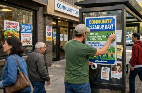
Strategic placement throughout neighbourhoods makes a big difference for poster effectiveness. High-traffic locations like bus stops, community centres, libraries, and local shops offer excellent visibility. Consider where your target audience regularly visits when planning your distribution strategy.
Industry guidance suggests placing posters at eye level for improved noticeability. Community organisers should position posters so the main message sits at average adult eye height. This makes details easy to read without straining and supports accessibility for various age groups.
Digital distribution channels work well alongside physical posters. Sharing designs on community Facebook groups, NextDoor, and local WhatsApp groups extends reach beyond physical locations. Many creation tools allow direct sharing to social platforms with properly formatted images for each channel.
Timing matters for poster campaigns. For most community events, posters should appear a couple of weeks before the event date. This provides enough advance notice without risking posters being covered by newer notices or becoming weathered and less attractive.